Tasked with painting a still life composed of boxes and bottles in shades of white and black, with oil paints in shades of white and black, it’s easy for a scientist like me to think about the usual suspects of depth cues as a path to success. After all, if depth cues are what we use to interpret the environment, then using them should translate to a successful painting, paint skill notwithstanding.
More distant objects should be smaller, brighter ones are close up, and so on. If only it were that simple.
Perhaps the best place to start this discussion is with a short rundown of perceptual depth cues put forth by psychological scientists.
There are two types of depth cues, physiological and psychological. Physiological depth cues involve a change in physiological mechanism. The following are of the most primary of these.
Accommodation: There is a tension resulting from the muscle changing the length of the eye lens that allows focus on objects at different distances. This depth cue is strongest for shorter distances. As we age, the muscles at work during accommodation weaken and the ability to see objects in focus further than arms length may need to be corrected. Some consider accommodation to be a monocular depth cue, requiring just one eye. You may notice that one of your eyes is better at focusing on nearer objects than the other. If a person relies specifically one eye for near sight, and the other for far sight, it is referred to as monovision.
Binocular Parallax: This is the difference between the images seen by each eye at any given point in time. Binocular parallax can be used to perceive depth in the absence of all other cues. Binocular parallax requires both eyes.
Convergence refers to the effect of the eyes pointing slightly inward when focusing on objects in the near distance. Convergence requires two eyes.
Monocular Movement Parallax: A monocular depth cue (one eye only), depth may be perceived with one eye closed using head movement and an extraction of the difference between two consecutive images.
Psychological depth cues, in contrast to physiological ones, involve a top-down cognitive assessment of the object. The following are six primary psychological depth cues.
Retinal Image Size. With a known real image size, say a tire for example, the mind and brain can then compare the perceived size of the object to encoded “known” or canonical size and infer distance to the perceived object.
Linear Perspective. Parallel lines meet at the horizon. Objects lying closer to the horizon line would be further away.
Texture Gradient. The detail of perceived surface texture decreases as distance to the object increases.
Occlusion. Also referred to as overlapping images, an object that lies in front of another object, thereby blocking some of the object behind, is perceived to be closer.
Aerial Perspective. Most relevant when perceiving landscapes with great depth, further horizons are perceived as hazier owing to the dust and particulate in the air between viewer and endpoint.
Shading and Shadows. Similar to occlusion, an object casting a shadow on another object another is nearer to the light source. Bright objects typically appear to be closer than dark objects.
Here is a wonderful article by Cutting & Vishton (1995) describing the ways in which depth cues are used, unused, integrated successfully and in some cases unsuccessfully in realizing veridical depth perception. In addition to outlining the use and misleading value of depth cues, they further postulate that the role of depth cue depends on distance/type of space. Moreover, they posit differences between personal space, action space, and vista space, which lead to different abilities to perceive depth adequately.
This list and article sets up the idea that depth cues may be nothing more than psychological constructs used to describe the invariabilities of relationships between objects in the depth plane. They say much less so, however, about how depth perception is actually achieved. That is, the eyes may converge on objects that are nearer but how, then, is the cognitive assessment of distance made? And, it says absolutely zero about how one should go about re-presenting 3-D space on the 2-D plane using a mixture of paint colors.
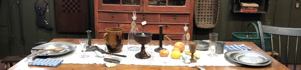
The painter professor does a good job constructing still life set ups that challenge these basic cues anyway. Darker colored objects would be placed on top of a box near the front of the set-up while taller, brighter objects were placed further away. It didn’t take long to realize that depth cues would not help and may possibly hinder my ability to paint.
So, what is it, then, about the near, grey bottle that lets you know it’s closer to the front of the space, especially since it’s smaller and darker than the bigger white bottle placed just a bit further away?

The answer: LIGHT patterns. A spot light placed at one end of the display illuminates a pattern of light and shadow, highlighting a pattern of hue, intensity, and temperature that , when all combined together, allow a person to correctly perceive the environment. In the painting above, hopefully it is clear that there is a light source coming from the near right corner. But a spot light isn’t necessarily needed to resolve ambiguities about objects placed in the depth plane. In any lit room, there is an array of light originating from a single natural light source (the sun) or any number of unnatural light sources (lightbulbs) combined with secondary arrays provided by reflection from surfaces including walls, windows, mirrors, and objects. This light array then provides everything that we need to perceive depth just by perceiving the qualities in the array. For painters, the patterns in the array are typically referred to using words such as value, intensity, hue, and temperature.
Ultimately, the challenge in painting still life may be distilled down to the ability to identify the objects within the patterns of dark and light.
To further parse the image into patterns of light, one may also use bisecting planes. The term “bisecting planes” is my own but the idea behind them is an old one. These are the words that I use to describe the process of laying an imaginary line – horizontal, vertical, or diagonal- across a perceived image such as a still life and judge the direction and distance each object lies from that line. This is essentially referring to the process of holding a paintbrush or a pencil in front of your perceived space to get a better understanding of proportion and layout. The bisecting plane operates like a horizon line but it doesn’t refer to any true horizon, just a line that bisect near from far, left from right, up from down. All objects, shadows, planes of light, shadows of dark can then be compared against the bisecting plane in terms of distance and size.
Using the painting above, a horizontal line running just at the front left corner of the bright white box puts the following in order in terms of distance in depth: the white bottle, then the far right and left corners of the box, the front left corner of the milk carton, and so on. Using a bisecting pane, one can then slice an image in two and perceive the objects within it as a function of distance from the bisection.
Bisection helps in orientation too. If we imagine a line running along the plane of the front right side of the milk carton, we can then work on establishing the relation of the box orientation to the carton, an orientation that is actually bit oblique to the carton.
Where is it brightest and where is it darkest? That can be a tricky question to answer even when you’re looking directly at an image and trying to establish as much. The grey bottle is bright because it is near to the front as well as the light source. But the white bottle is bright because it is bright white in real life, even without the light source shining on it.
If depth cues don’t work to help re-create a space then clearly being able to paint the patterns of light and dark should. Ultimately, the real task is to be able to just paint what you see. The problem is that it is a lot more difficult to see the world as it is than one might think. In a future post, I will focus specifically on the limits of the visual system in seeing the world.
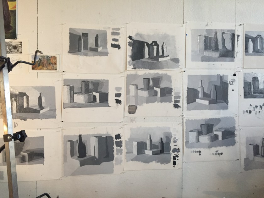
For now, enjoy the pictures, one including my colleague and fellow painting student Glenn in front of our group’s black and white still life paintings.


