 Everyone’s got a story. And, in “The Secret Lives of Color”, Kassia St. Clair gives colors with names befitting those delightful paint squares their autobiographical due. There’s White with some of its cousins including Lead White, Ivory, Silver, Whitewash, Isabelline, Chalk, Beige and Red with its associates Scarlet, Cochineal, Vermillion, Rossa corsa, Hematite, Madder, and Dragon’s blood for example.
Shades highlighted in the book (see the index for a lengthier list) were selected based on “particularly fascinating, important, or disturbing histories” found by the author. Naples yellow, first mentioned in the late 17th century, was historically noted as one of the best of the yellow tints even though it could be contaminated by metal or humidity. It is believed to have first come from Mt. Vesuvius, right near Naples, and survives today as a unique warm yellow found in many a painter’s box.
A good number of the color names are traced to their naturally occurring element. Emerald is based on the stone of course but Kassia helpfully outlines that is was the Egyptians who first popularized them around 1500 B.C. Avocado begets it namesake, but it’s interesting to read about its rise to fame in the 1970s when environmental health was brought to the fore and earthy colors became all the rage.
Colors like Prussian Blue, Kelly green, and Payne’s gray were developed by humans with intent and the results didn’t always go as planned. Prussian Blue began with a desire to make deep red but a mismanaged batch of potash reacted uniquely with iron sulfate to create a deep blue. When it turned out to work well with others pigments while being less expensive than haughty Ultramarine it became a mainstay. Payne’s grey was developed by landscape painter and teacher William Henry Payne by mixing Prussian blue, Yellow ocher, and Crimson lake to capture the pale blue appearance of distant landscapes. Kelly green’s Irish roots aren’t surprising. What is surprising is its association with the Irish movement towards independence from England and that flag’s color although the origin of the term “Kelly” remains unexplained. A Google search suggests its relation to the common Irish name Kelly but one has to wonder why it isn’t just called Irish green.

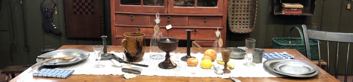
This isn’t the first time I’ve become enamored with color biographies. At the DeWitt Wallace museum, located the historic district of my hometown, there is an architectural exhibit highlighting, among other things, the distinct paint colors used in 17th and 18th century Virginia(Architectural Clues to 18th-Century Williamsburg). I found it incredibly compelling. There are some unique colors and saturations to be seen because the colonists were limited in the pigments and dyes available. The colors that have been unveiled using technical methods that can peel away layers, coat by coat (see above), were used as the basis for the Benjamin Moore Williamsburg Paint Color Collection. Names like Everard Blue, Bassett Hall Green, or Geddy Grey have bespoke names typically based on the location in which they were found. Thomas Everard served as Mayor of Williamsburg, VA in the mid- to late-1700s and the blue bearing his name was found on walls in his home. A restored version of the home still stands in Colonial Williamsburg. And yes, Everard blue found its way onto some of my own home walls.

There are two brief entries from Kassia that inspire deep thought and they happen to allude to two ideas I like to think about often. This first is her opener to the book, entitled ” Color vision: How we see”. Less than three pages, it isn’t exhaustive and by no means does it cover color processing, the visual system, or perceptual cues in any depth or breadth. But at its crux is a philosophical and scientific conundrum for the ages: color, as we perceive it, is that which is reflected from a surface. That is, an object is absorbing all but the color we in fact label it. Grass– in its essence then– is everything but green; it reflects green. It follows that color, as reflected light, is a perceptual by-product of the materials of matter. Let that sit for a while while we consider another idea.
“Do words shape the shades we see?” The sub-heading to Kassia’s “Colorful Language” entry, this question outlines another fantastic mind puzzle. William Gladstone’s mid-19th century analysis of Homer’s writings in terms of colors, color terms that is, is presented. They are in order and number: black (170), white (100), red (13), yellow, green, purple each mentioned less than 10 times. Blue, notably, is never mentioned. An analysis of biblical texts exhibits similar patterns. Physiologically, color perception has been in place since before these eras so one may not lay blame to color blindness. It is suggested, instead, that the lack of mention of such a perceived color may be due to the lack of term to describe it; without the word “blue”, the sky may not be described as such. The broader and vastly compelling implication is the idea that lack of a color term translates to lack of color perception. Put more simply, we may not see blue without a color name to identify it.

On this view, the greens we perceive above can only be as distinct as the colors names we have. One might say light green or even chartreuse to describe the grass. Forest green or hunter green may be used to describe the evergreen just right of center. But what are the rest of the color variations in the trees other than green, broadly defined? Kassia offers that the Korean language has words to set yellow-green away from standard green. Likely these terms would come in handy when describing the greens in the image above. So test yourself: how many greens do you seen? Mark them. How may terms for the greens that you see do you have? Label them.
There are plenty of colors that exist for which we have no name. Any experienced painter, especially with oils, will have some favorite color combinations to discuss. The color combinations exist because painters work to re-present the colors that they perceive in a scene that no prepared tube of paint can capture. Paints are intended to be mixed. Are there words assigned to these color combinations? Of course not, how could there be, with an infinite number of mixtures possible. Moreover, in many cases, the mixing happens online and without careful consideration. Two parts white, a smidge of orange, some green, a little cadmium yellow, a bit more orange and so on. In this sense, color may of course be perceived without having an identifying name. But the lack of name does guarantee that the color is not present in our narrative– our language, our discourse, our memory, our thought. With that true, the color ceases to exit at least nominally. Let that sit for a while.
 I’ll close with two or three final thoughts. The first is that I have often been struck, both as a thinker and as a painter, that the colors we perceive cannot simply be recreated in paint or on paper or even on film. There may be a quality or a translucence to them that another medium is unable to capture. A fine glass of French rosé wine has the most wonderful color that words cannot simply describe. It’s dusk and water and glimmer and skin all at the same time. Yes, those words describe; no, they do not capture. Nor does the image above. And I rest knowing that, unfortunately, it is impossible to paint a room the color of rosé wine.
The second is that colors are trendy. Pantone Color Institute has cleverly generated its “Color of the Year”, Ultra Violet for 2018.
Building on the organization’s foundational knowledge of consumer color preferences and color psychology, the Pantone Color Institute’s in-house team of designers, trend forecasters, and colorists consider “what’s bubbling up to the surface” across format and place. Contrary to the data-driven approach that some might imagine, it’s an entirely qualitative process seeking to identify new aesthetic ideas that might reveal something about our global mood. This year, everything from meditation-studio lighting, outer space, and emerging trends in the health food space factored into Ultra Violet’s selection.
from: https://www.architecturaldigest.com/story/behind-pantone-color-of-the-year-ultra-violet
So, the selection process is completely subjective. The end result is, however, completely contagious. Ultra Violet will be seen everywhere: paint, wallpaper, fabrics including clothing, carpets, and upholstery. It reminds me of a scene from “The Devil Wears Prada” when the character Amanda Priestly, so deftly played by Meryl Streep, explains to Anne Hathway’s character Andy that her “Cerulean” blue sweater can be traced to an Oscar de la Renta runway show of evening gowns in 2002 .
Colors are historical relics. They come from what we are as individuals, as a society, as a culture experience. Simple connections between color and form can be made: a lemon is yellow, lemon yellow is a color. The sky is blue, sky blue is a color. But colors, like emotions, are delimited; there are only so many. And, just like we may not see a color without a name for it, we may not feel an emotion without a label.
But there are experts, trained artists and trained therapists, that work diligently every day on trying to determine what we see or how we feel. And, if there isn’t a word available to use, one may very well be developed. Artists mix their colors and linguists mix their words. [Each year, Merriam-Webster adds new words to its volume.]
There are a few places where color names run the creative gamut. They have purposefully been given names to entice, persuade, comfort, make a statement. The name extends the color experience towards a feeling, attitude, priority, expectation. Check out Valspar’s paint offerings and you’ll find names like Sweet sixteen or Cuban plaza in their pink offerings, Sea swell and Ocean sigh representing different hues of blue. Farrow and Ball uses terms like Archive or Dimpse in place of beige or grey. Here’s a wonderful article about the multitudes of paint color names and why and how they influence us. 
Another place where color names take color to a different conceptual level: nail polish. A girlfriend showed me her newly pedicured toes last weekend with a sparkly lilic color on them and then she shared that it is called “Show us your tips”. It’s part of OPI’s Mardi Gras collection– of course. That’s pretty hilarious. And knowing that color is on one’s nails, doesn’t it, or wouldn’t it have to, have some downstream effect on emotion or behavior? The name is a perfect example of how a color might influence us.
In the end, colors tell a vivid story about who we are (or what we want to be) and what we see (or how we may be seen). Which will you choose?
