When the idea of the aesthetic experience is juxtaposed with intention and skill of the artist, the consideration about what or how a work is perceived or successful can get distorted. I like the challenge of trying to resolve what our cellular receptive fields respond to with how that may be competition with what we, as human observers, think we see.


Color constancy captures the competition between perception and reality quite well. Color constancy is the idea that the perceived or apparent color of a surface remains constant despite changes in the intensity and spectral composition of the illumination. For example, the dog above isn’t seen as a different color between the two images; the mind adjusts for the dimly lit image on the right and continues to perceive the dog as white and tan. For a fuller description of color constancy, see this super 2011 paper by David Foster in Vision Research .
Below is a well known figure used in discussions of color constancy that involves a green cylinder casting a shadow across a grey and white checkerboard base. Many readers will have seen this before. But if you haven’t seen this, or you can’t recall the trick, here it is: the tiles marked A and B are the same color. Yes, really.

At this point you will be thinking that this isn’t possible. At a perceptual level it can’t be possible that they are same color because we in fact see the square labeled A as much darker than the square labeled B. And, even without much thought we easily identify that the area marked A is a grey tile outside of a shadow whereas the area marked B is a white tile lying within a shadow.
Here are a few more slides of the same image. In Image 2, the portion in between the two tiles is covered with a black bar. Removing this single bit of contextual information allows it to become easier to see the similarity between A and B. Try squinting to help see the actual colors of A and B.


It easiest to see the similarity between the two tiles when black crossbars block out the tiles surrounding both A and B regions (Image 3). If you’re still having trouble seeing A and B as the same color, use your index fingers to provide vertical crossbars to isolate squares A and B. At that point, the similarity in color should pop out. You might also use post it notes on your computer screen to isolate tiles A and B in order to see them as they really are (the same color).
Let’s go back to Image 1. After learning about the tiles, can you more readily see that the two tiles are the same shade? The answer is probably no. Square A pops out as much darker so very automatically. The question is why.
In cellular terms, the colors are encoded as they are “seen”. You would think that if anything were to get it right, it would be the cells. But here’s where the top-down influence of context and surround play a role. The square demarked A looks dark because it is surrounded by areas that are lighter than it. In contrast, the square demarked B looks light because it is surrounded by areas that are darker than it. We cognitively interpret images based on our knowledge about the field set-up. In this case, we have a tiled base with a cylinder casting a shadow. Objects that lie in the shadow should appear darker than those not cast in the shadow.
Then there’s the properties of the responding cells. Some of our cells have receptive fields that are center-surround activated. Without going into too much detail, this means that they are primed to detect edges or the places where there is a light/dark contrast. This happens as early as the retinal level. Whenever an edge is detected (i.e., a light/dark contrast), the cells fire away.
So we have both top-down (cognitive) and bottom up (cellular response) processes driving our perception. I’m not the first to report that color is an illusion. But I do want to underscore the idea that if we are aware of the color constancies that our mind and brain works to preserve, then we can begin to train ourselves to really “see” the world the way it is. We will more easily realize that some colors in our environment, although perceived to be different, are actually the same.

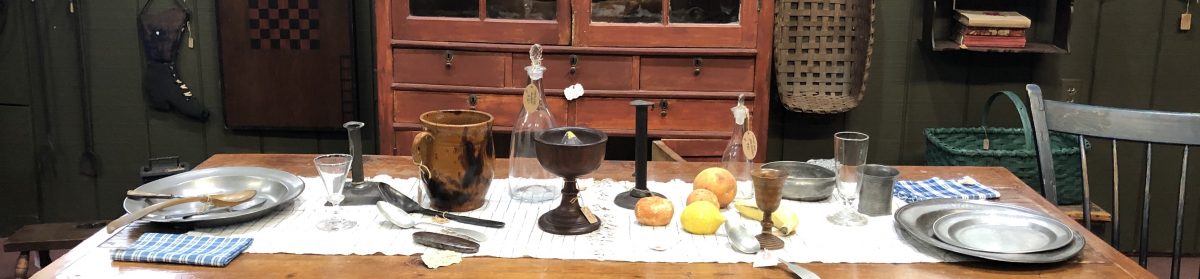
Here’s a picture (at left) of a room where a painting class is held. The painted tile floor is just like the base in the experimental image. If I squint my eyes, it looks to me like the furthest tile in the leftmost column is the same color as the tile third from the back one column away (i.e., the second from left column). But the one on the leftmost column is white in reality and the one in the adjacent column is grey in reality.

To successfully paint what we see, one must actively ignore knowledge about the situation (that there is an alternating grey and white tiled floor) and focus on how the tiles actually appear (as gradations of white and grey depending on location, luminance, and surround). To capture this difference by allowing for changes in brightness as the tiles recede towards the back of the stage would be real success.
